

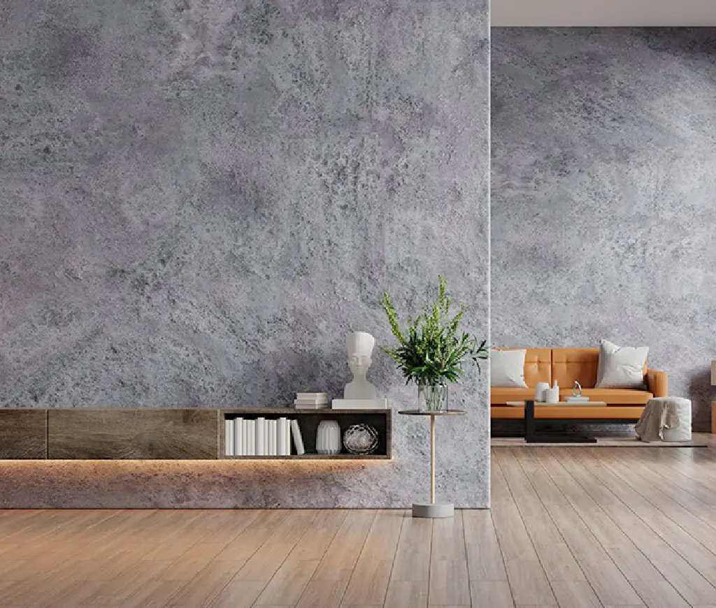
When it comes to transforming your home’s interiors, wall textures offer a unique blend of style and durability. Whether you’re updating a single room or revamping your entire house, the right wall texture can make a significant difference. In this blog, we explore the best wall texture finishes that combine aesthetic appeal with lasting strength, offering practical solutions for modern homes.
Why Choose Wall Textures?
Wall textures provide more than just a decorative touch; they offer numerous benefits that make them a top choice for homeowners looking for both beauty and functionality. Textures can help hide imperfections, add depth to a room, and even improve sound and thermal insulation. From subtle finishes to bold designs, there’s a texture for every type of home.
Best Wall Texture Finishes for Stylish Interiors
Here are the best wall texture finishes to elevate your home’s interior design:
1. Sponge Finish Texture
A classic choice for sophisticated interiors, the sponge finish provides a soft, subtle texture that adds depth and dimension without being overwhelming. This finish is perfect for living rooms and bedrooms where you want a calm and serene atmosphere.
Benefits:
- Smooth yet textured appearance
- Subtle elegance, ideal for minimalist spaces
- Durable and easy to maintain
2. Brushed Pearl Finish
For a more luxurious and glamorous look, the brushed pearl finish adds a soft sheen to your walls, making them appear elegant and refined. This finish works well in formal spaces such as dining rooms, lobbies, and master bedrooms.
Benefits:
- Adds a touch of luxury with a sparkling effect
- Reflects light, brightening up rooms
- Highly durable and scratch-resistant
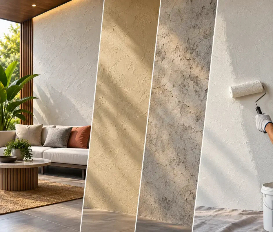
3. Stucco Finish
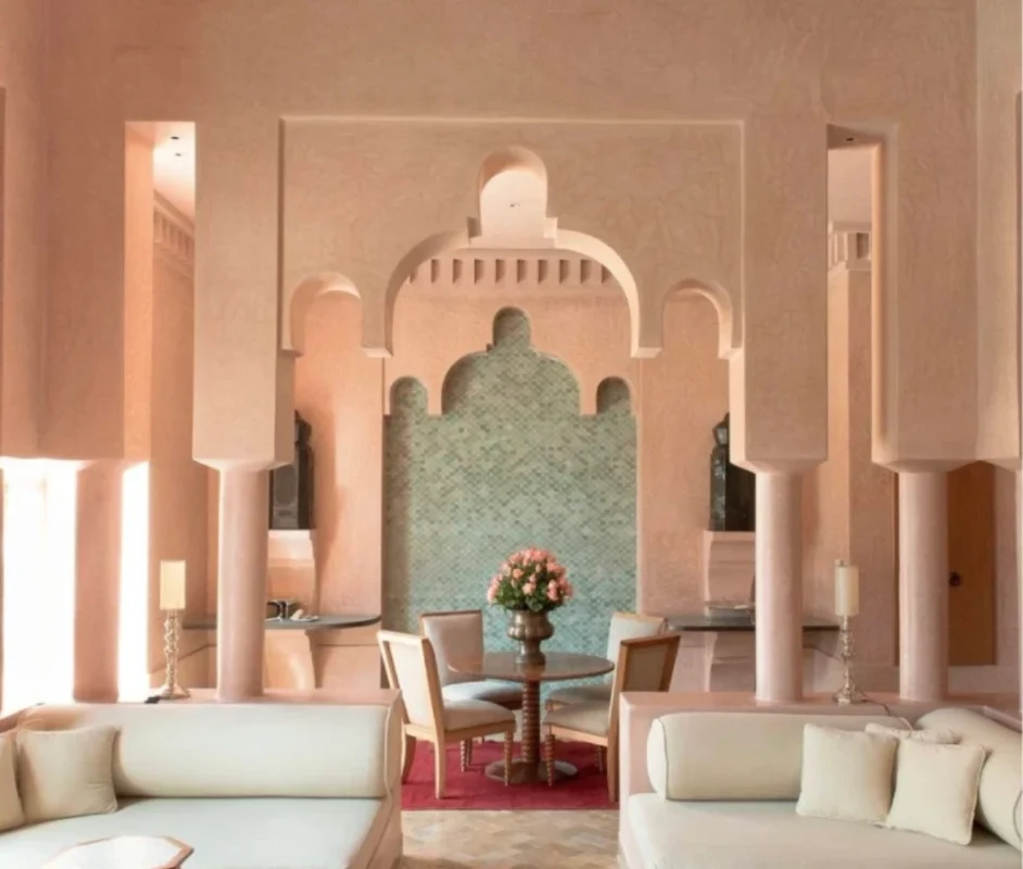
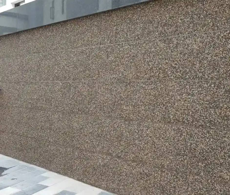
A popular texture inspired by Mediterranean and rustic designs, the stucco finish gives walls a rough, weathered look. This texture is ideal for homes that want to evoke a timeless, earthy charm. It’s commonly used in living rooms, foyers, and exteriors.
Benefits:
- Creates an old-world charm
- Adds character to both modern and rustic homes
- Excellent for both interior and exterior walls
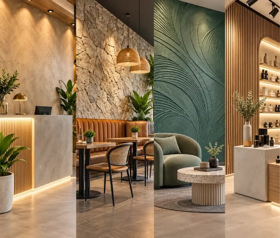
4. 3D Textured Walls
If you want something bold and modern, 3D textured walls are a perfect choice. These finishes create dramatic visual effects with their raised patterns and designs. Ideal for feature walls or accent spaces, 3D textures add a dynamic and eye-catching element to your interiors.
Benefits:
- Highly customizable to suit any style
- Ideal for accent walls or specific areas of the home
- Adds a futuristic and artistic flair
5. Knockdown Finish
The knockdown finish is a sophisticated and subtle texture that features a mix of smooth and rough surfaces. The finish is achieved by spraying a compound on the wall and then knocking down the peaks, leaving behind a soft, velvet-like texture. This works well in modern homes, especially in living rooms and hallways.
Benefits:
- Creates a unique, sophisticated look
- Highly durable and resistant to stains
- Low maintenance compared to other finishes
6. Sand Swirl Finish
If you’re looking for a decorative touch with a bit of flair, the sand swirl texture offers a swirling, smooth finish that adds an element of elegance. It’s often used in contemporary and transitional homes, especially in rooms with a more artistic or unique aesthetic.
Benefits:
- Adds elegance with swirling patterns
- Good for creating visual interest without overpowering the space
- Offers a smooth finish that’s easy to clean
The Benefits of Textured Walls
Choosing wall textures over traditional paint can offer several benefits:
- Durability: Textured walls tend to be more durable than painted surfaces, requiring fewer touch-ups and repairs over time.
- Low Maintenance: Unlike paint, textured finishes resist staining and scuff marks, making them ideal for high-traffic areas.
- Aesthetic Appeal: Wall textures add dimension and depth to rooms, offering a more dynamic and visually interesting finish.
- Increased Insulation: Many textured finishes provide additional sound and thermal insulation, contributing to a more comfortable home environment.
How to Choose the Right Wall Texture for Your Home
Selecting the right wall texture depends on your home’s design style, the function of the space, and your personal preferences. Here are a few tips to guide your decision:
- Consider the Room’s Function: For high-traffic areas like hallways or kitchens, consider durable textures like knockdown or stucco. For living rooms and bedrooms, more subtle textures like sponge finishes or brushed pearl might work best.
- Match Your Interior Style: If you have a modern or minimalist home, go for textures that add subtle depth, like sponge or knockdown finishes. For a more rustic or Mediterranean feel, stucco is the perfect choice.
- Experiment with Accent Walls: Don’t be afraid to try bolder textures like 3D walls or sand swirl finishes on accent walls. These textures can add an exciting focal point to any room.
Conclusion
Wall textures offer a wide variety of finishes that can transform any space from ordinary to extraordinary. Whether you’re looking for a timeless, rustic look or a bold, contemporary statement, there’s a texture finish to suit every style and need. Choose the one that best complements your home’s design, and enjoy the perfect balance of style, durability, and functionality.
Address: Plot 2, Nav Maharashtra Society, Hotel Navratna Lane, Satara Rd, near City Pride Theater, Pune, Maharashtra 411009
Phone: 088303 28133
Ready to transform your home with beautiful wall textures? Contact us today to explore the best wall texture finishes for your interiors. Call 088303 28133 to book a consultation or visit our office at the address above!
I am revisiting my seasonal analysis because olive undertones seem difficult for questionnaires. I have naturally dark hair and my eyes are medium brown, so the overall contrast can look winter-like. At the same time my skin has a green-gold cast that automated tools often interpret as warm. Bright orange overwhelms me while cool berry and deep teal are usually easier to wear. These color tests prompt me to consider whether I belong in a cool winter range or a softer neighboring season. [url=https://seasonal-palette.top]olive skin tone seasonal palette[/url] offers a useful framework but I do not want to force the result to match one chart. For a simple home comparison would you compare pure white with cream before testing accent colors? Jewelry comparisons do not settle it so I need clues that work better for olive skin. I can keep lighting and exposure identical and review whether shadows, redness, or eye definition change. What cool shades would you compare first without relying on stereotypes about skin depth? Real comparisons from similar coloring would be especially useful. I care more about consistent clues than matching every traditional description perfectly. I appreciate any practical suggestions
I am revisiting my seasonal analysis because olive skin can produce contradictory results. My hair is very dark and my eyes are medium brown, so the overall contrast can look winter-like. On the other hand my skin has a green-gold cast that automated tools often interpret as warm. Bright orange overwhelms me while cool berry and deep teal are usually easier to wear. That pattern makes me wonder whether I belong in a cool winter range or a softer neighboring season. [url=https://seasonal-palette.top]olive skin tone seasonal palette[/url] gives me a structured reference but I do not want to force the result to match one chart. During a basic draping session would you compare pure white with cream before testing accent colors? Jewelry comparisons do not settle it so I need clues that work better for olive skin. I can keep lighting and exposure identical and review whether shadows, redness, or eye definition change. Which winter colors would you test first without relying on stereotypes about skin depth? Advice from people with this undertone would be especially useful. I care more about repeatable evidence than matching every traditional description perfectly. Thanks for helping me compare these clues
I have a haircut appointment next month and saved several reference photos, but the cuts look quite different on the people wearing them. Several have hair tucked behind the ears, so it is hard to tell what comes from the cut and what comes from the person’s features. I initially searched for [url=https://faceshapecheck.top]personal color analysis[/url] because I was also thinking about a possible color change. That seems useful for a different decision, while my immediate question is about proportions around the face. I am thinking of bringing photos of my current hair, along with a few examples of the lengths I actually like. I also want to check my face shape without treating one online label as a strict rule for every haircut. Comparing a couple of neutral photos might help, although the way my hair falls around the jaw changes the outline quite a bit. If you have had this conversation with a stylist, which observations were useful to mention? I would rather discuss styling time and texture too, instead of expecting a face shape category to choose the cut for me. Any tips for comparing the photos fairly would be appreciated.
I’m trying to work out whether Deep Summer or Deep Winter is closer to my coloring. Dark navy usually feels comfortable on me. That observation isn’t enough to settle it, because my photos change a lot between daylight and warm indoor light. Pure white sometimes seems too stark against my face. Muted berry and charcoal seem promising, but I can’t tell whether that’s because of their depth or their softness. I would rather compare clothes I already own than buy a new set of drapes. I came across a page about [url=https://hair-color.top]deep summer color palette[/url] while collecting examples for a side-by-side check. Is charcoal against black a useful first comparison? I’m looking for a test I can repeat in the same light, not a diagnosis from one selfie. Which comparison helped you separate softness from depth? I plan to keep the camera position consistent. This may help me notice the color differences more clearly. I can ask a friend to look at the same set of photos so I don’t rely entirely on my own impression. A short sequence of comparisons would be very helpful.